Color plays a crucial role in office interior design, serving as a vital element in creating atmosphere and shaping overall style. Effective use of color helps to delineate functional areas, evoke emotions, boost productivity, and elevate corporate culture.
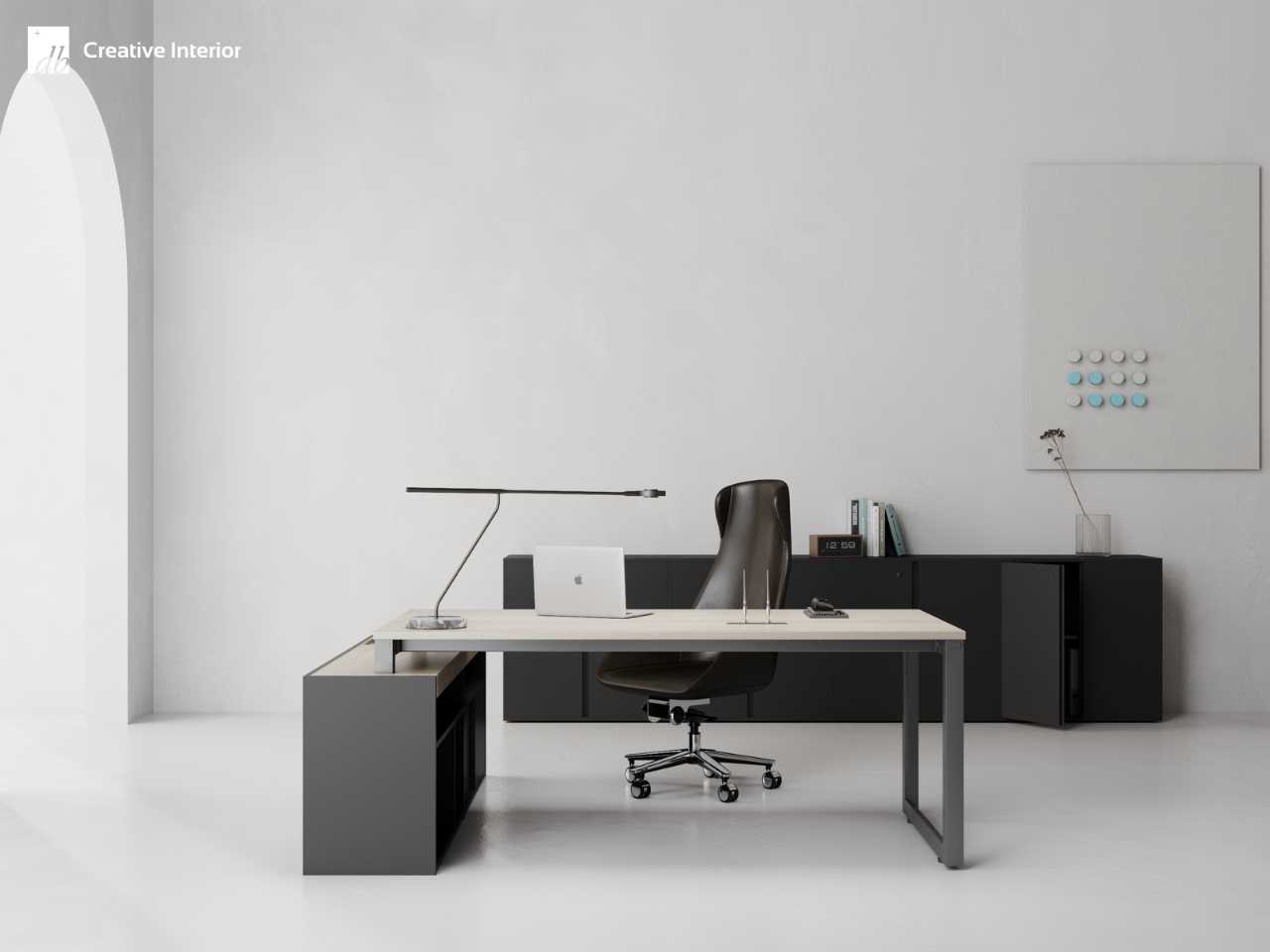
The office of DBPlus radiates sophistication, tailored with a gray and black color palette and harmonizing monochromatic accents, catering to clients’ tastes
Color is not merely about simple shades; it is also a powerful tool that impacts human perception, emotions, and behavior. According to the Color Research Institute, 62% to 90% of evaluations about a space or product are based on color. Research from the University of Texas also confirms that color influences brain responses, thereby affecting the productivity and attitudes of employees. Understanding the power of color is key to designing office spaces effectively, conveying messages, and creating strong impressions.
Psychological effects of color
Color plays an important role in creating atmosphere and influencing human psychology. Therefore, using colors effectively in office design contributes to creating an efficient and positive work environment.
Each color evokes different emotions and physiological responses. For example, warm colors like red or yellow bring a sense of energy and excitement, while also increasing heart rate and blood pressure. In contrast, cool colors like blue or green create a feeling of calmness and relaxation, helping to regulate blood flow.
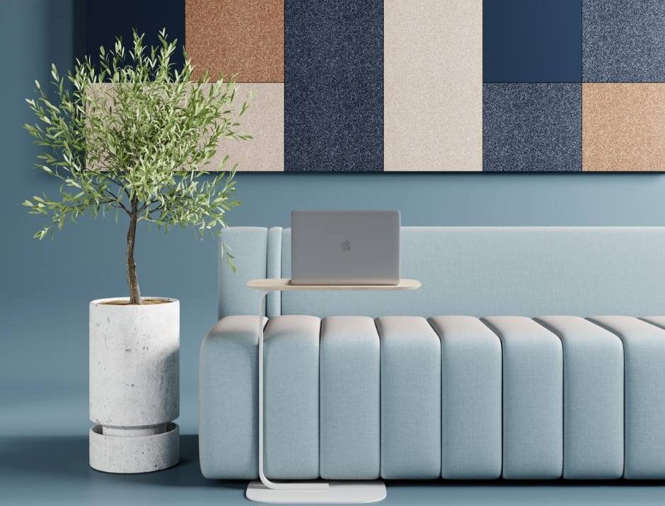
The emotional ambiance shifts distinctly through color tones and mood; blue induces relaxation and tranquility, while pink stimulates motivation and energy
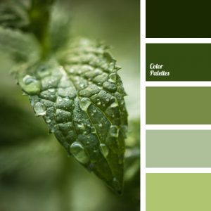
Numerous studies have confirmed the impact of color on work efficiency. According to a report from the University of Munich, exposure to green, even briefly, can enhance performance in creative tasks. Cooper’s “Human Spaces” report on color psychology also indicates that using light green, light blue, and yellow in the workplace correlates causally with increased productivity and creativity.
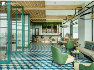
The pantry area, designed by DBPlus with a dominant green color scheme, creates a visually pleasing, refreshing, and tranquil atmosphere, perfect for relaxation
Combining colors scientifically creates an ideal working environment. Using light green or light blue as accent colors for common areas and workspaces helps create a sense of calmness, tranquility, reduces stress, and improves concentration. On the other hand, using bright colors like red and yellow in break rooms and reception areas stimulates energy, promotes interaction, and social collaboration among employees.
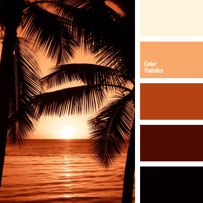
The relaxation area of a client’s office, designed by DBPlus, features warm tones of orange and brown, creating a cozy atmosphere, stimulating energy, and enhancing interaction
Color Mapping: Distinct Relationships in Different Regions
The important thing is to consider the specific functions of different areas within the office when selecting colors. For example, using cool colors in conference rooms helps create a sense of importance and professionalism, while warm color palettes in reception areas promote a welcoming and friendly atmosphere.
>>> Explore more: The Projects of DBPlus
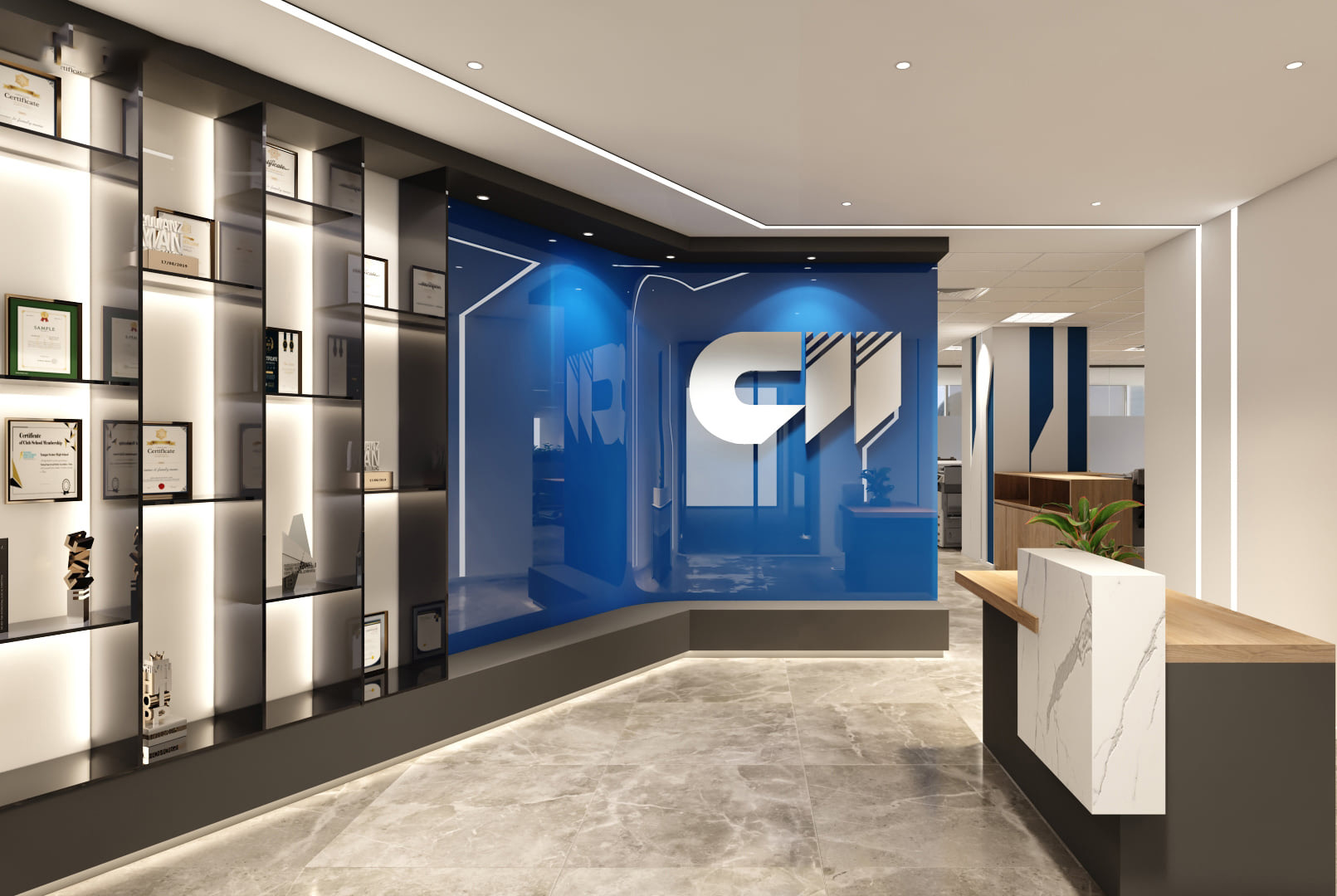
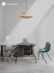
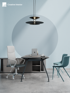
For the CII office, DBPlus opted for a dominant grayish-blue color scheme, crafting an elegant, professional, and comfortable
Many creative workspaces opt for yellow as an accent color because it is seen as an optimistic color that can foster higher levels of creativity, especially in collaborative fields. However, some color combinations should be used with caution. For instance, white can make some rooms appear larger, although this doesn’t mean every surface in the office should be white, as it may evoke a clinical feeling more suitable for medical facilities. Conversely, using darker colors in the workspace, especially if they are dominant, can enhance a soothing effect to the extent of increasing mental stress and eye strain for workers when mental activity decreases, making it difficult for them to concentrate on work.
By considering the specific functions of different areas within the office, office interior designers use accent colors to enhance the overall design and improve usability as well as the atmosphere of the specific office environment being addressed.
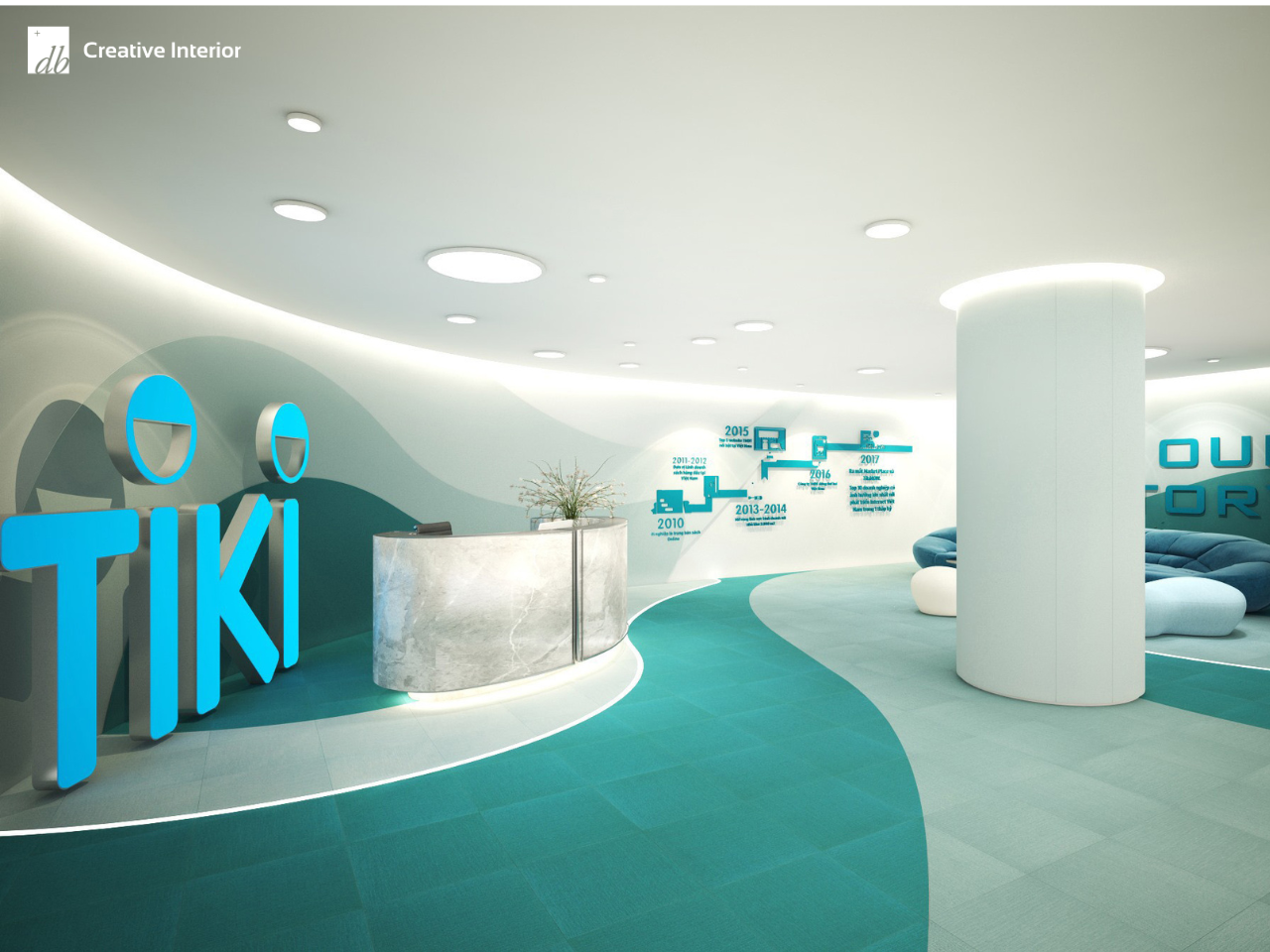
By employing a monochromatic blue color scheme in designing the TIKI office, DBPlus has created a space brimming with energy and daily refreshment
Another important consideration is the function of color schemes for different areas of the office. For example, using a monochromatic scheme consisting of lighter shades and neutral colors in the workspace creates a sense of simplicity and order, which can improve office productivity and focus. On the other hand, incorporating complementary color schemes – such as bright accent colors with vivid reds or bright greens – in a breakout space can create a vibrant, energetic feel, encouraging social interaction and relaxation.
The Takeaway
Using color in the interior design should not be limited to simple choices between neutral color themes or primary colors for accent walls. Although any color scheme chosen will have a significant impact on the overall design, functionality, and productivity of the space. By understanding the psychological impact of colors and striving to balance colors appropriate to the specific functions of different areas within the office, users and designers can use color to enhance the overall design and improve the feel and productivity of the office.
With creativity and knowledge of color psychology and design principles, DBPlus is committed to creating attractive, efficient, and aesthetically pleasing office spaces – bringing long-term happiness to employees and impressing clients and visitors.